
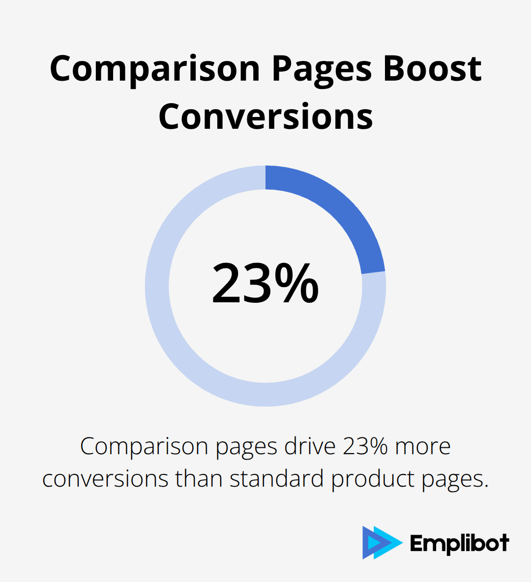
Comparison pages drive 23% more conversions than standard product pages, yet most businesses struggle to create content that actually helps searchers make decisions.
The secret lies in understanding exactly what users need when they’re weighing their options. At Emplibot, we’ve analyzed thousands of high-performing comparison pages to identify the specific elements that turn browsers into buyers.
This guide reveals the proven strategies for building comparison pages that satisfy searchers and boost your bottom line.
Understanding Search Intent for Comparison Pages
Commercial investigation keywords represent the goldmine of comparison page traffic, with searches containing “vs,” “alternative,” “comparison,” and “best” generating higher conversion rates than generic product terms. These searchers sit at the bottom of the marketing funnel with credit cards ready, making them worth 3x more than informational traffic according to WordStream data. Focus your keyword research on modifiers like “versus,” “compared to,” “alternative to,” and “review” alongside your product category. Tools like Ahrefs reveal that comparison keywords have 65% lower competition than head terms while maintaining strong search volumes.
Analyzing SERP Features and Competitor Content
Search results for comparison queries tell you exactly what Google values for that intent. When featured snippets appear for your target comparison keywords, they typically pull from tables or structured content that directly answers the “vs” question. Study the top 3 results to identify common elements like pricing tables, feature matrices, and pros/cons sections.
Competitor analysis reveals content gaps where you can differentiate. If competitors focus heavily on features but ignore pricing or user experience, that becomes your advantage. Google My Business listings and review snippets in SERPs indicate that social proof carries significant weight for these searches.
Mapping User Journey from Comparison to Decision
Users who search comparison terms follow a predictable three-stage journey that smart marketers can map and optimize for. Stage one involves broad category research where they learn about available options. Stage two narrows to specific product comparisons where they evaluate 2-3 solutions. Stage three requires validation through reviews, case studies, and social proof before purchase.
Your comparison page must address all three stages simultaneously. Include educational content for early-stage visitors, detailed feature comparisons for evaluation, and testimonials with conversion-focused calls to action for decision-ready prospects. Funnel analysis research shows that pages addressing multiple funnel stages convert better than single-stage content.
The foundation you build through intent analysis directly impacts how you structure your comparison tables and present information to maximize conversions.
Essential Elements of High-Converting Comparison Pages
Feature comparison tables convert better when they limit attributes to 7 or fewer rows, according to research on user behavior patterns. The most effective tables position your product in the leftmost column where Western readers naturally start their scan, then arrange competitors by market share or relevance. Include only attributes that directly impact purchase decisions like pricing, core features, support options, and integration capabilities. Skip technical specifications that confuse rather than clarify choices.
Structure Tables for Maximum Scannability
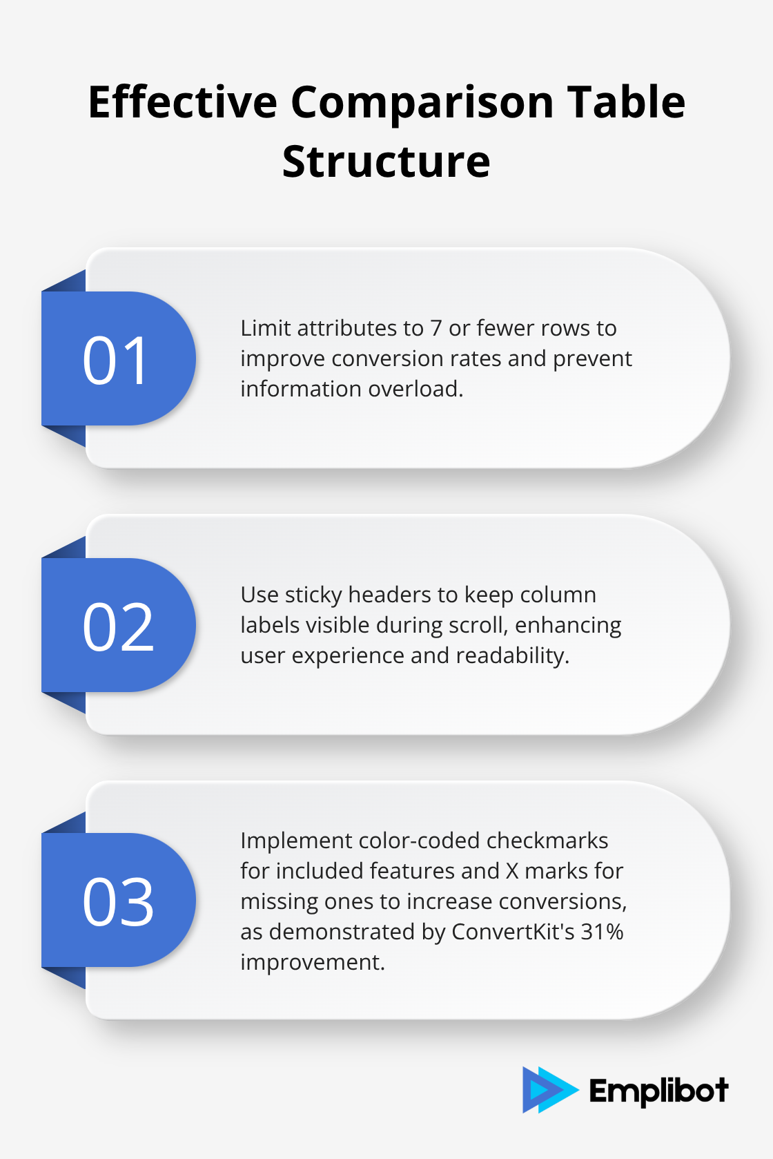
Static comparison tables outperform dynamic ones for products under 5 options because users prefer controlled information flow over choice paralysis. Use sticky headers so column labels remain visible during scroll, and highlight key differences with subtle background colors rather than bold text. ConvertKit increased comparison page conversions by 31% after they implemented color-coded checkmarks for included features and X marks for missing ones. Mobile users need tables converted to accordion or tab formats since horizontal scroll kills engagement rates.
Integrate Third-Party Validation Sources
G2 ratings, Capterra reviews, and Trustpilot scores provide the social proof that transforms skeptical browsers into confident buyers. Display star ratings prominently near product names and include specific review counts rather than vague testimonials. Zendesk saw 28% higher conversion rates after they added G2 comparison data directly within their feature tables. Screenshot actual user reviews that mention specific pain points your product solves, and link to full review profiles for credibility.
Add Visual Elements That Build Trust
Visual elements like dashboard screenshots and product demos reduce bounce rates by 45% compared to text-only comparisons. Authentic user-generated content builds trust that generic marketing copy cannot match. Include side-by-side interface comparisons that show actual product workflows (not mockups or staged demos). Video testimonials from real customers carry more weight than written reviews because they’re harder to fake and create emotional connections with prospects.
These visual and social proof elements work together to address the trust barriers that prevent conversions, setting the stage for technical optimization that helps search engines understand and rank your comparison content effectively.
SEO Optimization Strategies for Comparison Content
Comparison page URLs must follow a predictable pattern that search engines and users can understand instantly. The optimal structure places your brand first followed by the competitor, like yoursite.com/vs/competitor-name or yoursite.com/your-product-vs-competitor. This format performs better than generic comparison URLs according to industry research. Create dedicated pages for each major competitor rather than lump multiple comparisons together, since Google rewards focused content over broad overviews. Internal link architecture should connect comparison pages to your main product pages, pricing pages, and feature documentation with exact-match anchor text that includes your target keywords.
Schema Markup Drives Rich Snippet Visibility
Product comparison schema markup increases click-through rates because it helps search engines display structured data in results. Implement Product schema for each item you compare, including ratings, prices, and availability status. Table markup schema works particularly well for feature comparison tables, helping Google understand your content structure and potentially display it as a featured snippet. Review schema from third-party sources like G2 or Capterra adds credibility signals that Google factors into rankings. The combination of proper schema implementation and structured data testing through Google Search Console identifies optimization opportunities that competitors miss.
Featured Snippet Optimization Captures Position Zero
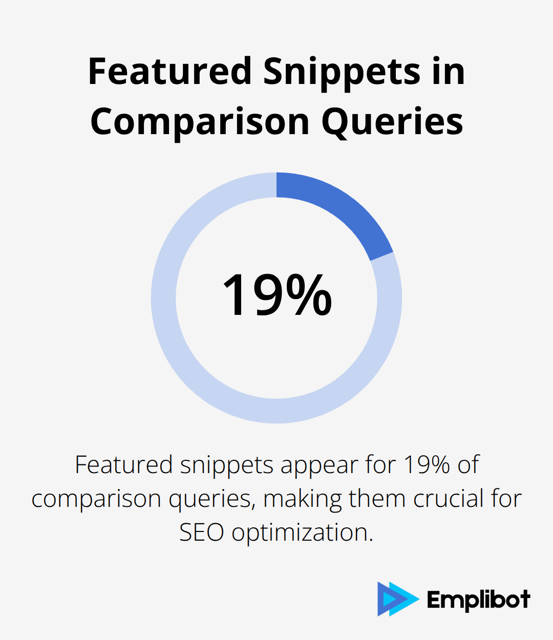
Featured snippets appear for 19% of comparison queries, making them worth aggressive optimization efforts. Structure your content to answer specific questions like which product costs less, which offers better support, or which integrates with popular tools. Use header tags that mirror common search questions, then provide direct answers in the first paragraph that follows each header. Tables formatted with clear headers and concise data points have the highest featured snippet selection rate for comparison content (especially when they address specific user pain points). Monitor Google Search Console performance reports to identify queries where your comparison pages rank positions 2-10, then optimize those pages specifically for featured snippet capture since most featured snippets come from pages already on page one.
Mobile Optimization for Comparison Tables
Mobile users abandon comparison pages more often when tables don’t adapt to smaller screens. Convert horizontal comparison tables to accordion formats or tabbed interfaces that allow users to switch between products easily. Sticky navigation elements help mobile users jump between different comparison sections without endless scrolling. Test your comparison pages on actual mobile devices rather than desktop browser simulators, since touch interactions behave differently than mouse clicks. AI SEO tools can help automate mobile optimization testing and identify performance bottlenecks across different devices and screen sizes.
Final Thoughts
Comparison pages that satisfy searchers balance user needs with search engine optimization requirements. The most successful pages combine comprehensive feature tables with authentic social proof while maintaining mobile-friendly designs that convert browsers into customers. Three critical mistakes destroy comparison page performance: overwhelming users with too many attributes, neglecting mobile optimization, and failing to include third-party validation.
Pages that avoid these pitfalls see conversion rates up to 31% higher than generic product content. Your next step involves auditing existing comparison content against these proven strategies. Focus on implementing structured data markup first, then optimize your feature tables for scannability.
Emplibot can automate the content creation and SEO optimization process (handling everything from keyword research to WordPress publishing while you focus on strategy development). The businesses that consistently rank for high-intent comparison keywords understand that these pages serve as decision-making tools rather than promotional content. When you prioritize searcher satisfaction over self-promotion, both rankings and conversions improve naturally.
